
Scroll down

Focusing on people is our identity.
Focusing on people is our identity.
What makes us so excited for what’s next?
We never lose sight of what matters most to us: people’s right – and the people we protect them with.
To do this, we even follow an unwritten law: Sometimes, you have to reinvent yourself, in order to stay true to who you are. But how exactly?
At first glance: unmistakable, personal and accessible. You can feel it. And experience it. In every situation and in every detail. For our customers and colleagues – focusing on people is our identity.


Form follows focus through and through.
Always keeping an eye on what matters most – design maxim and core of our corporate strategy.
Form follows focus through and through.
Always keeping an eye on what matters most – design maxim and core of our corporate strategy.
Form follows focus through and through.
Always keeping an eye on what matters most – design maxim and core of our corporate strategy.
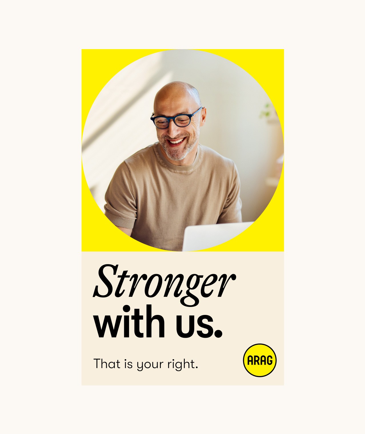
The logo – in form and colour – is the origin of the new design. The circle forms a protective frame and focuses on what is most important to us: our customers.
The logo – in form and colour – is the origin of the new design. The circle forms a protective frame and focuses on what is most important to us: our customers.
The logo – in form and colour – is the origin of the new design. The circle forms a protective frame and focuses on what is most important to us: our customers.
The modularity of the design system makes it extremely versatile. It offers great creative freedom as much as high recognition value.
The modularity of the design system makes it extremely versatile. It offers great creative freedom as much as high recognition value.
The modularity of the design system makes it extremely versatile. It offers great creative freedom as much as high recognition value.
The colours:
Radiating the brand.
While staying true to ourselves, we’ve refreshed and expanded the ARAG colour palette.
The colours:
Radiating the brand.
While staying true to ourselves, we’ve refreshed and expanded the ARAG colour palette.
Our new colour combination creates a positive, welcoming yet clean look.
Our new colour combination creates a positive, welcoming yet clean look.
The typography:
a distinctive custom-fit.
The combination creates characteristic images that are strong and serious on the one hand, and modern and personal on the other.
The typography:
a distinctive custom-fit.
The combination creates characteristic images that are strong and serious on the one hand, and modern and personal on the other.
The typography:
a distinctive custom-fit.
The combination creates characteristic images that are strong and serious on the one hand, and modern and personal on the other.
The contemporary condensed typeface is complemented by a classic but expressive serif typeface.
The contemporary condensed typeface is complemented by a classic but expressive serif typeface.
The contemporary condensed typeface is complemented by a classic but expressive serif typeface.
To make our new typeface even more round in the truest sense of the word, individual letters were adapted to the logo.
To make our new typeface even more round in the truest sense of the word, individual letters were adapted to the logo.
To make our new typeface even more round in the truest sense of the word, individual letters were adapted to the logo.
Our visual language:
authentic and accessible.
We give real insights into people’s lives and thereby show: We stand by their side, no matter where they are or what worries them.
Our visual language:
authentic and accessible.
We give real insights into people’s lives and thereby show: We stand by their side, no matter where they are or what worries them.
Our visual language:
authentic and accessible.
We give real insights into people’s lives and thereby show: We stand by their side, no matter where they are or what worries them.


Our pictures tell the story of our customers. That’s why we don’t stick to one style, but always choose the one that best suits the story and the people.

In every detail,
a unique facet.
Come closer – it’s sometimes worth looking closely at everything.
In every detail,
a unique facet.
Come closer – it’s sometimes worth looking closely at everything.
In every detail,
a unique facet.
Come closer – it’s sometimes worth looking closely at everything.
Illustrations: A Personal touch.
As with our photographs, people are at the heart of our illustrations. The style is clear and realistic, yet also handmade and simple. This adds another, very personal visual layer to the design language without detracting from it.
Illustrations: A Personal touch.
As with our photographs, people are at the heart of our illustrations. The style is clear and realistic, yet also handmade and simple. This adds another, very personal visual layer to the design language without detracting from it.
Illustrations: A Personal touch.
As with our photographs, people are at the heart of our illustrations. The style is clear and realistic, yet also handmade and simple. This adds another, very personal visual layer to the design language without detracting from it.
The icons: Simply special.
The icons speak a design language of their own, derived from the logo with its round and angular shapes. They form a unique collection, tailor-made for ARAG.
The icons: Simply special.
The icons speak a design language of their own, derived from the logo with its round and angular shapes. They form a unique collection, tailor-made for ARAG.
The icons: Simply special.
The icons speak a design language of their own, derived from the logo with its round and angular shapes. They form a unique collection, tailor-made for ARAG.
Infographics: Already got it.
Infographics use black outlines to frame each element. ARAG Sand shades offer a neutral base, while ARAG Yellow highlights key details — always used purposefully to make information easy to grasp.
Infographics: Already got it.
Infographics use black outlines to frame each element. ARAG Sand shades offer a neutral base, while ARAG Yellow highlights key details — always used purposefully to make information easy to grasp.
Infographics: Already got it.
Infographics use black outlines to frame each element. ARAG Sand shades offer a neutral base, while ARAG Yellow highlights key details — always used purposefully to make information easy to grasp.
User Interface: Let’s be clear.
Apart from the logo, all the interactive elements are round. Everything else is angular. This improves user guidance and accessibility. Different states are distinguished not only by colour, but also by line thickness.
User Interface: Let’s be clear.
Apart from the logo, all the interactive elements are round. Everything else is angular. This improves user guidance and accessibility. Different states are distinguished not only by colour, but also by line thickness.
User Interface: Let’s be clear.
Apart from the logo, all the interactive elements are round. Everything else is angular. This improves user guidance and accessibility. Different states are distinguished not only by colour, but also by line thickness.
The range of
applications: Limitless.
As strong as the brand’s recognition is, so great is the creative freedom it offers designers.
The range of
applications: Limitless.
As strong as the brand’s recognition is, so great is the creative freedom it offers designers.


Our single source
of truth.
For everyone who wants to know everything even more precisely.
Our single source
of truth.
For everyone who wants to know everything even more precisely.


There’s no end to change. Still, thank you to everyone who helped create this milestone. Let’s keep going.
That is your right.